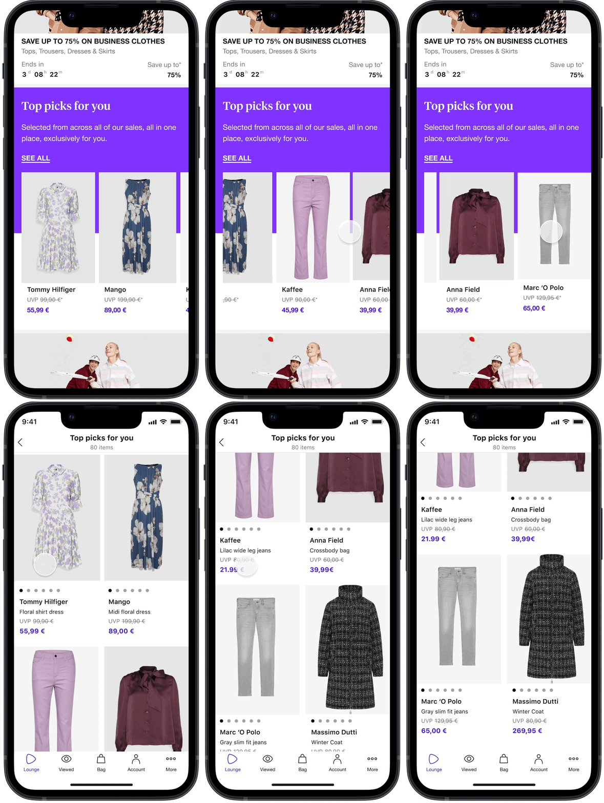
Top picks for you
A special sale that helps users save time searching, with only the most relevant items selected across all sales, all in one place.
1st new feature using personalization!
How might we help each customer quickly discover inspirational products as they browse the catalog?
Summary
Problem
Lounge users are frustrated with the overwhelming number of assortment and want better ways to find what they’re looking for.
Solution
A selection of 80 items from across all available sales in one singular catalog based on users’ past browsing and shopping behavior from Lounge by Zalando and Zalando.
Who I collaborated with
Product manager, engineers, user researcher, data scientist, data analyst
My role as Design Prime
I led the design initiatives of this new feature from discovery to delivery
This project led to many successful new collaborations and the usage of new tools for the first time
Gathering insights
Lounge by Zalando has a unique way of shopping compared to standard e-commerce sites. Users have to browse through different sales to discover great finds instead of searching for specific items.
After synthesizing qualitative studies and onsite feedback surveys, we found that Lounge users feel overwhelmed by the large selection and want easier ways to find what they want.
“I can’t find anything I like!”
Defining the problem
Problem framing workshop
I organized and facilitated a problem framing workshop, interviewing 6 experts to uncover main catalog page issues.
Using insights from the interviews and other qualitative and quantitative research, we identified key issues and establish a shared "How might we" to guide us in our ideation workshop.
Wireframes & concept testing
Our winning idea from the ideation workshop became “Top Picks for You”. We wanted to help users save time from browsing through multiple sales and just give them 80 top recommendations in one sale.
For the initial prototype, we began by going big and bold, introducing exciting new features we thought would aid our users’ pains.
Initial wireframes
In the initial wireframes, I wanted to include the features the team were excited about and see how they could fit together in the user journey.
Prototype & testing
We partnered with Lounge stylists who are experts at compiling stylish pieces together and worked with them to personalize the top 80 items for each of the 8 test participant’s “Top picks for you”.
Our data analysts pulled each participant’s past browsing and shopping data, so we knew the brands and types of items they’re interested in.
What we learned
With the success of the concept test, we saw how excited users were to try out “Top picks for you”. After discussing with engineering and PM, we decided to test more stripped down versions since we couldn’t add all the features right away.
Some features we wanted to include
Explicit feedback symbols
Browse by favorite brand
Items grouped by themes/categories
Tags to highlight characteristics of items
Ways to customize the items on the list
A/B Testing: iOS
Our initial A/B tests were on iOS because it had the largest user base and we had iOS engineering capacity. If Top Picks for You succeeds on iOS, then we would test the feature on Android and Web as well. In order to move fast, we needed to work within our constraints.
Design rationale
-
We had limited graphics and colors in our design system, which was going through an overhaul. We used the gem icon to signify to users they could find their treasure here. This is the first use of a solid-color banner on the home screen.
-
To increase click-through-rate (CTR), we partnered with the Graphics & Content team to supply banner imagery to us. We changed the imagery every few days based on how often our users would return. We had to manually add these images which increased the app size and took time. This approach wouldn’t be scalable unless we made changes to our banner production tool.
-
After seeing the success of the first 2 A/B tests, we invested more time and effort in implementation to address users’ jobs to be done and gave them a sneak peak of what’s in their “Top picks” by introducing a product carousel.
A/B Test Results (per user)
Overall, we shipped Top Picks for You to all iOS users after Version 3 because our KPIs were increasing significantly:
Avg # of items added to cart
Avg # of items purchased
Avg gross merchandise value (GMV)
We also saw that it was taking users significantly less time to add articles to their cart (vs having no TP4U).
Onsite Feedback Survey
Throughout our A/B tests, we triggered a survey to users that visited TP4U a 2nd time.
We learned that 61% of respondents were satisfied with Top Picks for You, but those that weren’t were mainly dissatisfied due to items not being relevant enough.
Using this feedback, we gave recommendations to our data scientists to improve the model.
Now live on all platforms!
~
Now live on all platforms! ~
Successfully introduced on Web & Android
Due to the success of the latest design on iOS, we introduced TP4U to other platforms where we saw significantly positive results as well across the board.
Desktop banner: slightly different design than apps due to different grid layout
Customer Feedback
As we continuously improved Top Picks for You, we saw in our onsite surveys that satisfaction increased from 38% to 61%.
“Saves me so much time! Top picks is top! ”
🇩🇪 User from Germany
“I love finding all different things from my favorite brands.”
🇮🇹 User from Italy
“It’s very easy to come to this one sale and find something I like.”
🇪🇸 User from Spain


